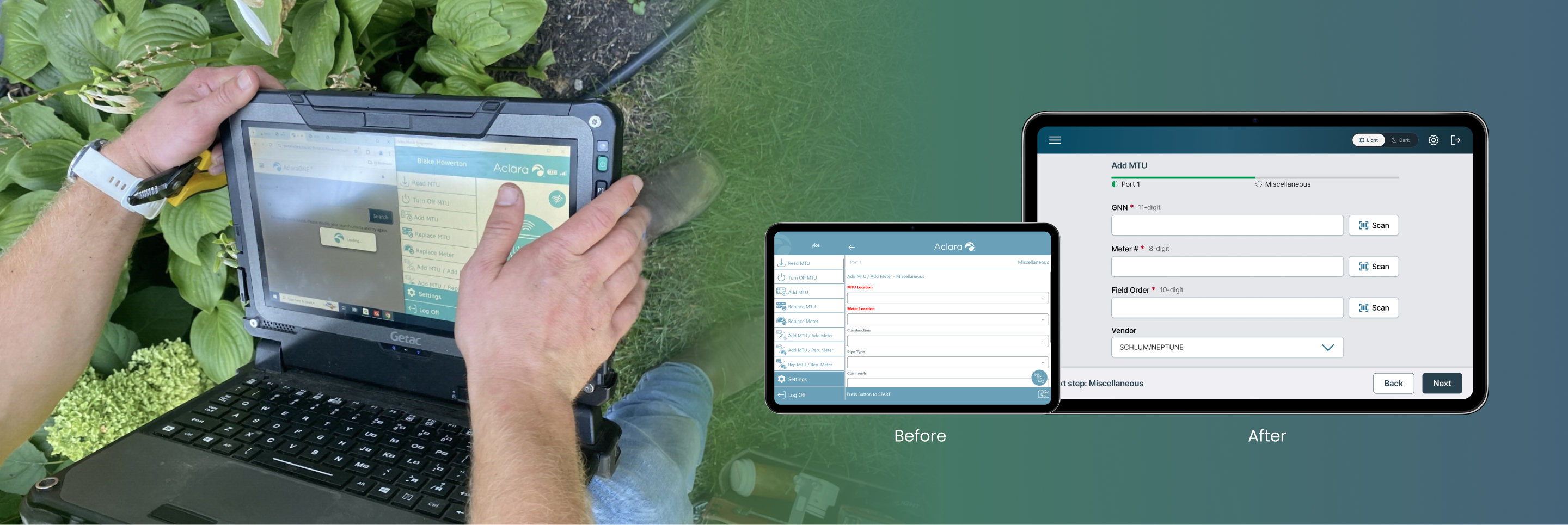

Redesigning a cross-device tool that helps field technicians program more efficiently on-site.
May - Jul 2025 (10 weeks)
User Research
Product Design
1 Product Manager
3 Software Engineers
1 Product Designer (me)
Figma
Figjam (Technical workflow mapping)
Zeroheight (Design System management)
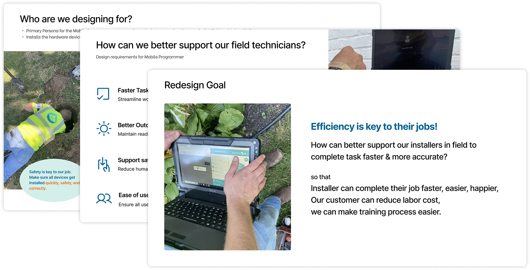
Mobile Programmer is a field programming application used by technicians to install Meter Transmission Units and ensure proper network connections and data transmission. However, users reported that it frustrating and difficult to use in the field.
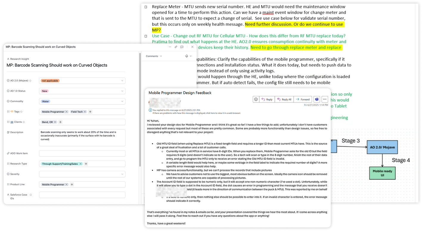
I dug deeper into the user context by reviewing previous on-site documentation, examining user feedback dialogs, and talking with as many people as possible from the market and training teams.
Since I couldn’t visit clients on-site within the project timeline, I focused on collecting and synthesizing available internal resources instead.
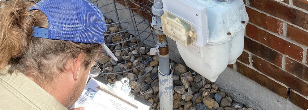

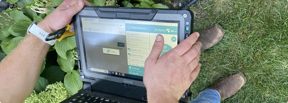
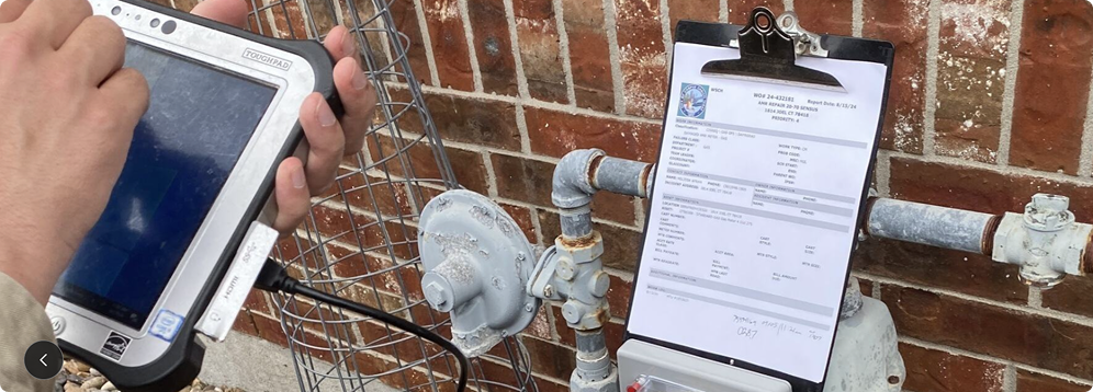
Technicians frequently shift between bright outdoor sunlight and dark underground basements, requiring a display that remains visible and legible under extreme lighting contrasts.
Technicians often wear protective gloves or work with dirty hands, requiring touch interfaces that accommodate gloved interaction.
Technicians frequently use mobile programming alongside other platforms simultaneously, this constrains the available screen real estate, necessitating efficient information hierarchy.
Technicians are paid by the hour and judged by how quickly they can complete their jobs, which makes every delay or confusion directly impact their income.
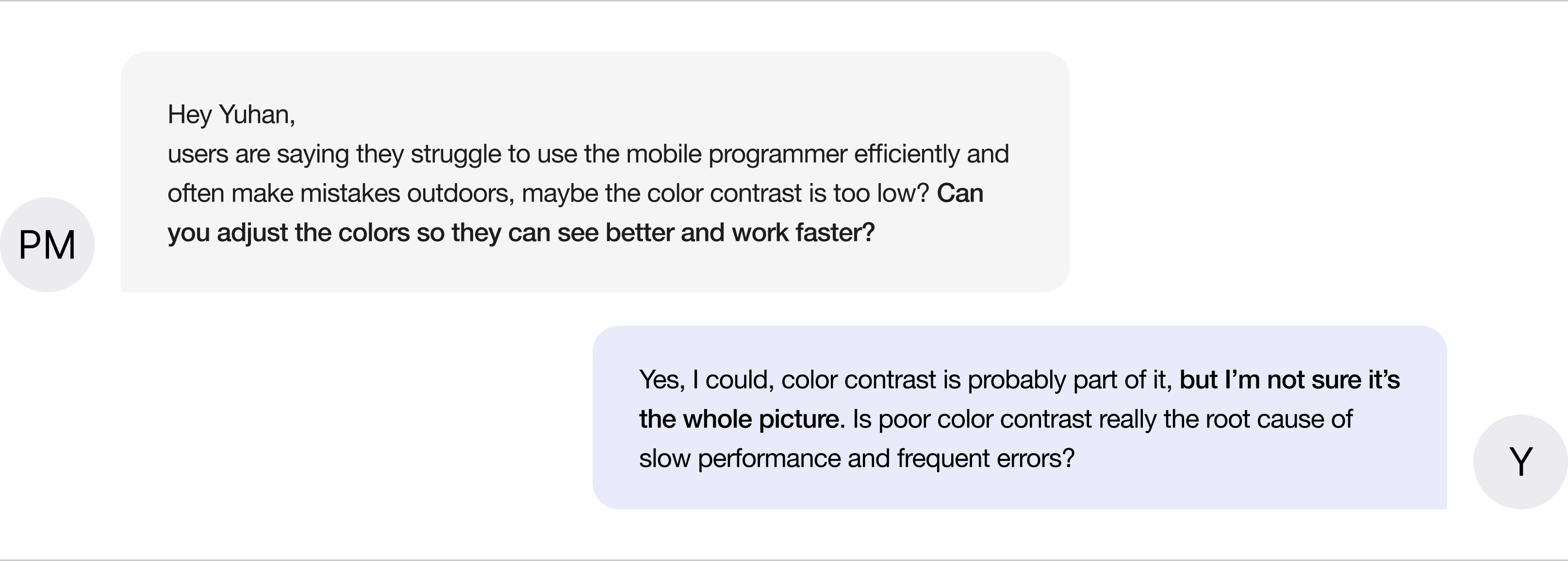
Then I audited the current interface (based on using context) and identified 3 usability gaps. In addition to the visual contrast issue raised by the product manager, I discovered 2 more critical barriers that affect workflow efficiency and accuracy.
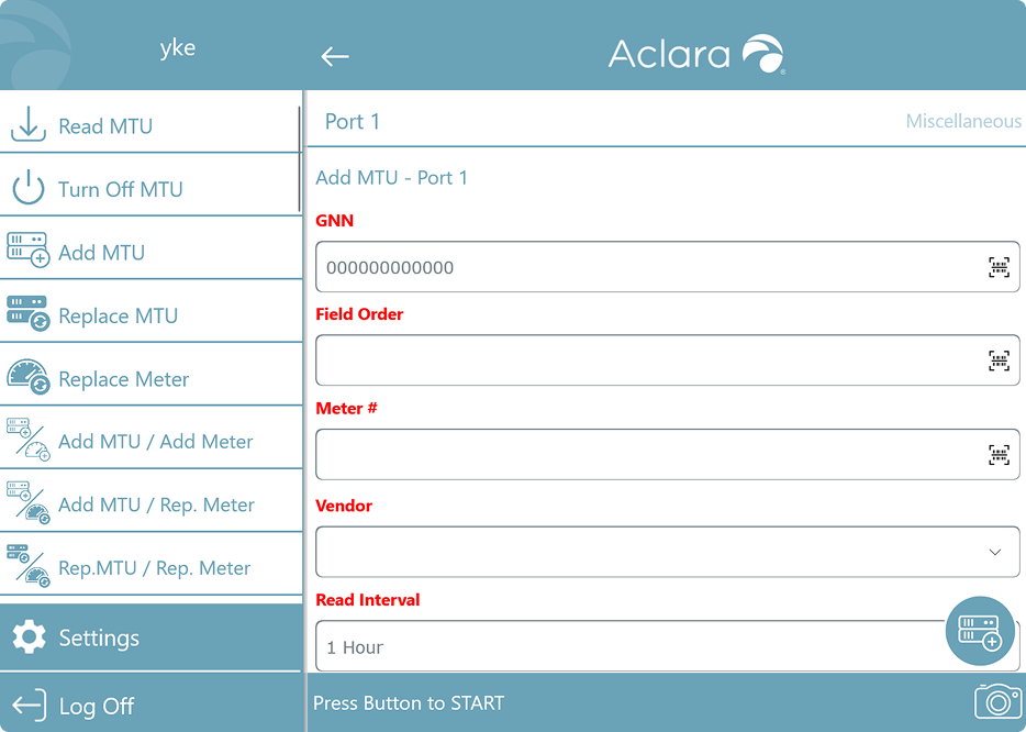

Technicians frequently shift between bright outdoor sunlight and dark underground basements, requiring a display that remains visible and legible under extreme lighting contrasts.

Technicians often wear protective gloves or work with dirty hands, requiring touch interfaces that accommodate gloved interaction.

Technicians frequently use mobile programming alongside other platforms simultaneously, this constrains the available screen real estate, necessitating efficient information hierarchy.
I proactively communicated with my manager and internal stakeholders to understand how the Mobile Programmer fits into the larger business ecosystem, from field operations to client contracts and training processes. Through these conversations, I was able to connect the usability issues I identified to their real business consequences.
1. Slow work = Unhappy clients = Lost contracts
Field techs are paid hourly and are judged by how quickly they can complete jobs. If the software is confusing or slows them down, it hurts both their experience and our company's reputation, utility companies may think twice before renewing contracts.
2. High training cost from low intuitiveness
The system’s lack of intuitiveness leads to repeated training and support, increasing operational costs. In a high-turnover environment, the tool must be intuitive enough to stand on its own, not dependent on training to be usable.
To ensure alignment, I prepared a concise report that connected each usability issue to its broader business impact and illustrated why a simple color change wouldn’t solve the underlying problems.
By framing the findings through both a user and business lens, I facilitated a productive discussion with the product manager, aligned on the need for a deeper redesign, and gained buy-in before moving into the design phase.
All interfaces were redesigned to optimize field operations with two core goals: Improved program efficiency and enhanced visual and touch accessibility for all users in challenging field conditions.
Measurable impact: The redesign delivered significant improvements across all key metrics.
(The results come from usability testing conducted after the redesign, with 7 participants completing standardized tasks in simulated field environments.)


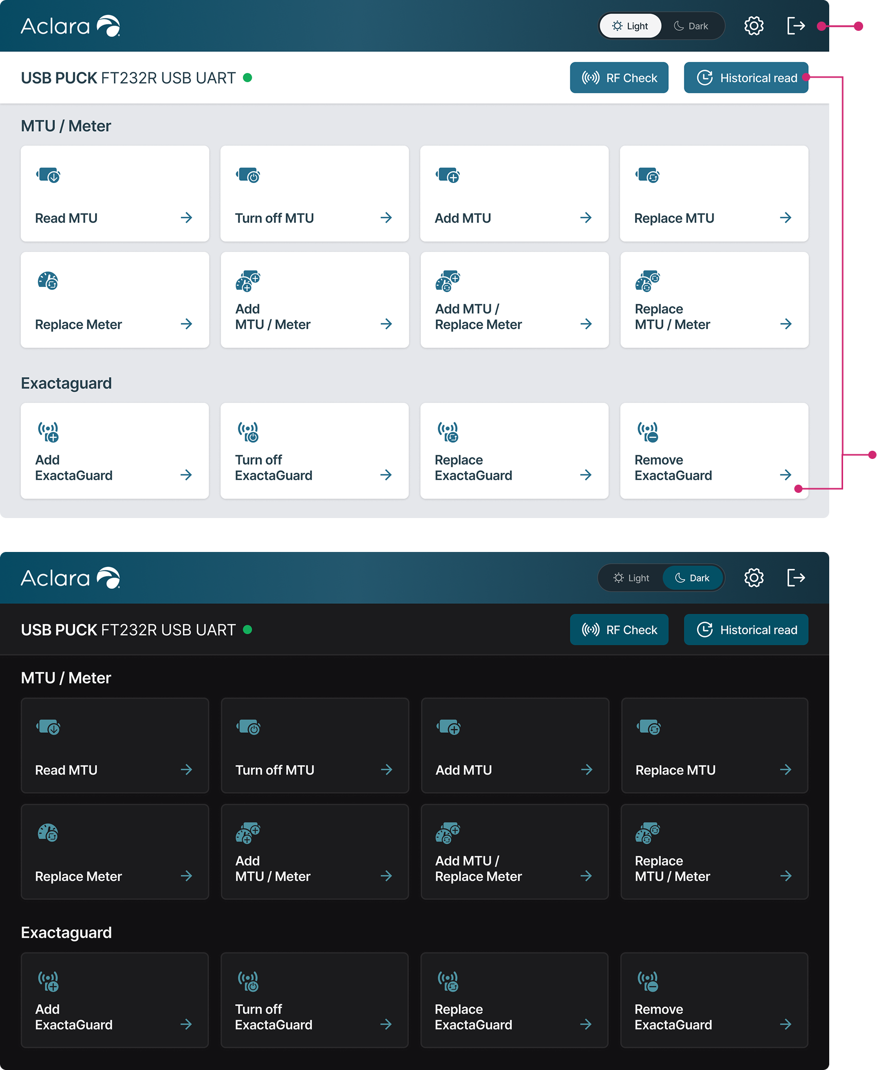
Dual-Mode contrast system, both modes guarantee WCAG AA compliance.
Optimize for efficiencyRestructured the interface with a tile-based layout, organizing functions into clear, scannable groups.
Surfaced action items upon landing, eliminating the need for scrolling.
Increased touch target sizes and breathing room between elements.


Clear context within the
multi-step workflow.
Added digit counts beside each field, enabling installers to verify correct entries even when terminology might vary.
Separate scan button, easier to tap for installers wearing gloves.
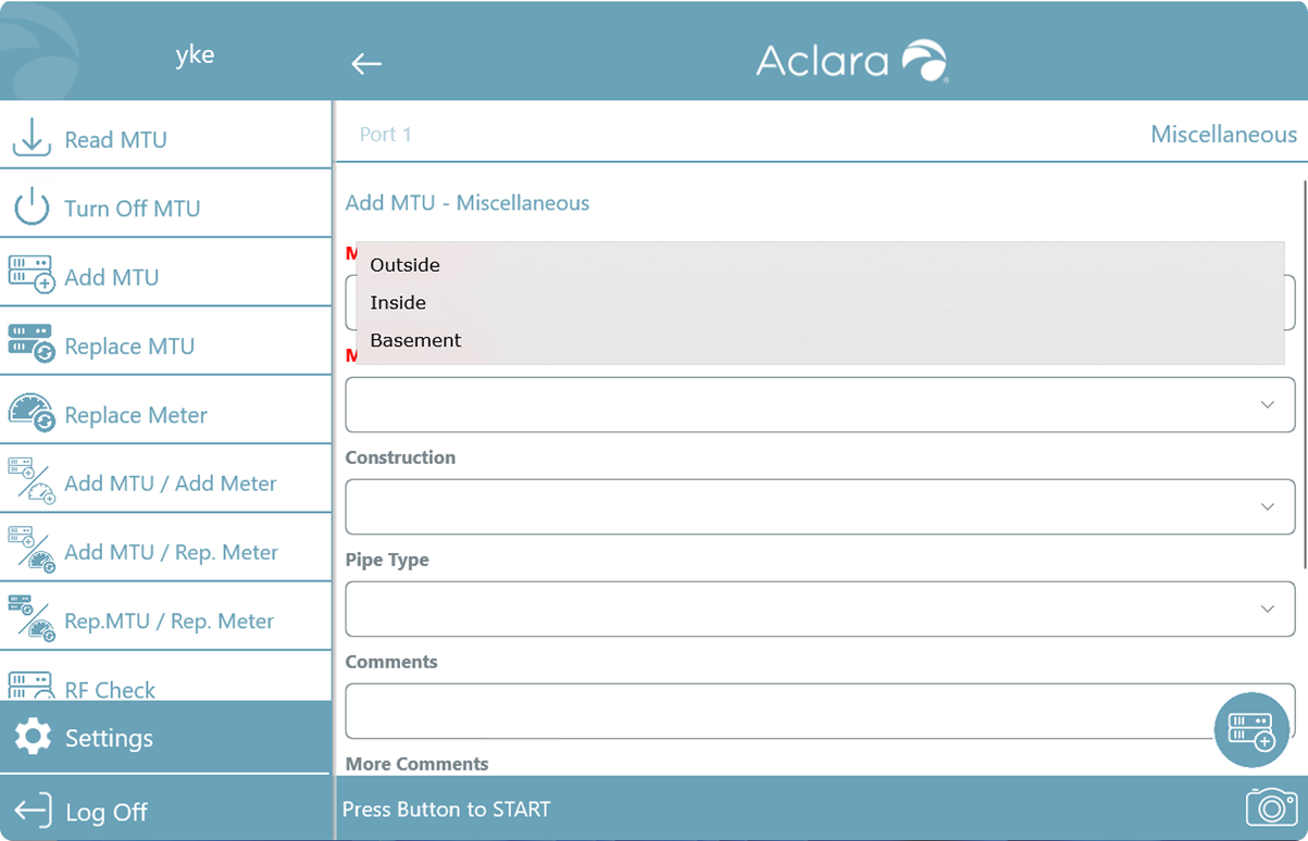

Replaced dropdowns with button groups for fields with limited options.
Smart defaults, for gas equipment, "Outside" is pre-selected to reduce repetitive selections.


Grouped related data into modular cards with a clear visual hierarchy.
Users can verify results at a glance without reading technical details
Prioritized critical information at the top, users can quickly troubleshoot errors.
Ideally, I wanted to visit the field, conduct contextual inquiry, and observe workers using the tool in their real environment.
But in reality, I couldn't schedule site visits during this timeframe, so I pivoted to alternative research methods:
Dug into previous site visit documentation to understand existing pain points
Initiated conversations with training/marketing teams and sat in on training sessions to identify recurring struggles
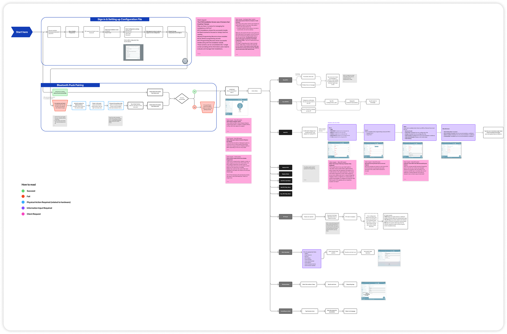
Created visual diagram maps to synthesize findings, organize unknowns, and formulate targeted questions for stakeholders
By connecting the dots, I reconstructed the field context and built a clear, reliable picture of user frustrations.
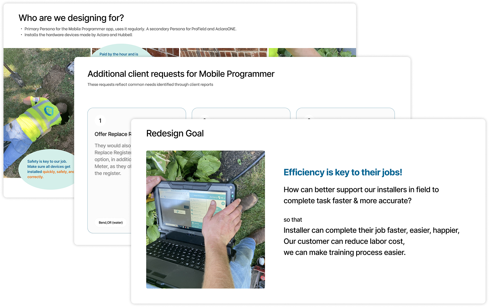
Ideally, all stakeholders would see the value of user-centered improvements and support the design changes.
But in reality, the organization didn't yet have a mature design culture, and not all teams had strong design intuition. So I did internal persuasion work:
Translated UX proposals into business outcomes, showing how improvements would reduce support costs, improve customer retention, and win RFPs.
Aligned recommendations with PM and leadership priorities — connecting user pain points to their KPIs and business goals.
Before implementing, I first had to earn buy-in by speaking their language.
Even with stakeholder support, I faced implementation constraints: Engineering bandwidth was limited, and not every good idea could ship within the timeline.
So I prioritized strategically:
Worked closely with engineers to understand code structure and estimate implementation effort for each design change.
Identified quick wins, prioritizing fixes that required low effort but delivered high value.
Focused on frequency and impact — targeting pain points that caused the most user errors and business friction.
By making data-informed trade-offs, I maximized user impact within constraints.

Interested in the full case study?
Please feel free to reach out to learn more about this work and my process in detail.
Curious? Feedback? Collaboration?
I'd love to meet you :)
Feel free to grab a virtual coffee with me via Calendly!
This website is best viewed on desktop
Copyright © 2024 Yuhan Ke